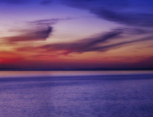
“Often while traveling with a camera we arrive just as the sun slips over the horizon of a moment, too late to expose film, only time enough to expose our hearts”… Minor White
Why is monochrome (sometimes referred to as Black & White) photography different from color? To many, monochrome delivers a different feeling since our everyday world is made up of colors. In other words monochrome is not our reality.
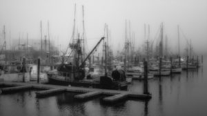 In the 1930’s and 40’s monochrome images were the norm in newspapers and magazines. Color film came along and changed everything, sometimes not for the better. However for many photographers color presented a lot of challenges, as it still does today. Paul Strand said of color film, “It’s a dye, it has no body or texture like paint does. So far it doesn’t do anything but add an uncomfortable element to a medium that is hard enough to control anyway.” In monochrome imagery there is less “going on” and allows the viewer to delve into the image quality more than color. Reading the history of monochrome imagery is fascinating and I encourage every photographer to do so. Study the works not just of Ansel Adams, but these of the great Minor White, Harry Callahan, Edward Curtis, Edward Weston and so many others. One of my favorite monochrome photographers was Robert Frank who was known for saying “Black and white are the colors of photography. To me they symbolize the alternatives of hope and despair to which mankind is subjected”. Study his work. He is so right.
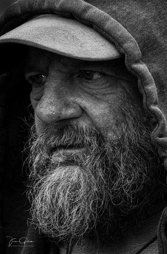
To me there are two types of monochrome photography. One is more documentary and the other uses textures and evoking deep feelings of a fine art print.
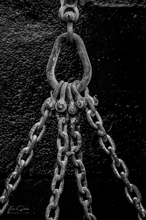
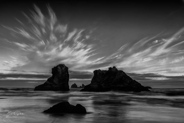
 In many images the use of monochrome brings out the shapes and textures stronger than color. Perhaps it’s that in many images color can be distracting and actually taking away the drama of the scene. In monochrome photography one can adjust the brightness, shadows and contrast to their individual liking, just as we can with color, but the unexpected often is stronger to the viewer. Color evokes emotional responses like monochrome image. We all like different levels of color. At times these emotional decisions take over the attention of the viewer.
Over processing is commonplace these days. This of tends to distract from the power of a well-made photograph. How often do we hear “Wow look at the color of that amazing sunset” or “Look at the color in those trees”. Perhaps the other elements of the image were really what made the image work but the color became overpowering in the viewers mind, leaving that is really important to be secondary. Eliminating color often allows the shapes and graphic design of the image to be much more dominant. In general, monochrome images are open more three dimensional, unless the color, texture and more is handled correctly, which is not easily done. My dear friend Guy Tal is one who has mastered this. Guy is a master at using color the right way. In his work, color adds to the texture and dimension.
 What is hardest for most photographers, but absolutely necessary is visualizing the final image. We have so many choices in determining exposure that thinking about how you want the final image to be rendered determine how you initially make the image in the camera. DO you want the sky light or dark? How do you want to render the clouds? How to handle the tonal relationships must be considered.
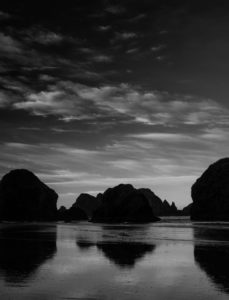
Often in photography we hear the terms High Key and Low Key. HIGH-KEY is a bright image with the main subject being different shades of grey. Snow scenes are often depicted this way. LOW KEY images are dark where the subject matter is depicted by highlights. Shapes are usually stronger and often tell a story of doom and gloom. To me low key images evoke more emotion in the viewer. I personally love using Low Key scenes when at the coast.
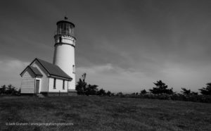 Most photographers adhere to the bad light rule. In other words when the light is harsh they go have lunch or scout for locations to photograph when the light gets right. This is a good time to make monochrome images. Alfred Stieglitz said “Where there is light, there is a photograph”. This is so true. Monochrome images in harsh light can tell a wonderful story. Yes it’s a bit tougher to make a quality image, even in monochrome than in the soft light of the early mornings and evenings but often it opens up opportunities for some great photography.
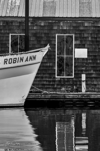
What’s important when making monochrome images is to be aware of shapes, contrast and exposure in a different way than color. Many of the rules still apply. Simplify even more in Monochrome. All images must have a story, but in monochrome I believe we might consider not telling the whole story. Leave some suspense. Perhaps don’t resolve the story.
It is only by observing our world of color, which we sometimes take for granted that we can learn to make good Monochrome images. By learning how all the shades of gray, shadows, highlights, textures etc. depict color we can all learn to make successful monochrome images. Monochrome is an alternative way of seeing a different reality within its own a powerful means of expression.
© Jack Graham / Jack Graham Photography LLC All Rights Reserved
Jack Graham uses exclusively FUJIFILM mirrorless cameras and FUJINON lenses
