 WORKSHOPS:: www.jackgrahamphoto.com/photo-workshops (2011 & 2012 schedules are there) PODCAST: www.18percentgraymatter.com
JACK GRAHAM PHOTOGRAPHY MAIN WEBSITE: www.jackgrahamphoto.com
 OCTOBER 2011—–FALL in NE OHIO & a day with the AMISH —FILLING FAST https://www.jackgrahamphoto.com/fall-color-ne-ohio-well-very-special-day-amish-oct-2011
 ICELAND 2012—FILLING FAST https://www.jackgrahamphoto.com/ultimate-iceland
______________________________________________________________________________
News & Notes:
Outdoor Photo Gear recently had a reprint of an article from this blog on their site (they gave an excellent blog area). Today they used one of my photographs on their home page……
thanks guy’s !! www.outdoorphotogear.com if you haven’t visited them (click on the banner below) & check them out. They are a truly 1 stop shop for the coolest photo accessories and more around.

___________________________________________________________
Naturephotgraphers.net (www.naturephotographers.net also published a new essay of mine “The 10 Commandments of Photography” recently. http://www.naturephotographers.net/farchives.html Give it a read, as well as the other articles from Guy Tal and Alain Briot. NPN is THE premier online forum for photography.
______________________________________________________________
![]() And don’t forget my friends at HUNT’S PHOTO & VIDEO. http://www.huntsphotoandvideo.com/ ., by far the best in the industry—Call Gary Farber for the best pricing and selection, yes better than NYC!!! (800) 221-1830 x 2332 and tell Gary I said hi!
And don’t forget my friends at HUNT’S PHOTO & VIDEO. http://www.huntsphotoandvideo.com/ ., by far the best in the industry—Call Gary Farber for the best pricing and selection, yes better than NYC!!! (800) 221-1830 x 2332 and tell Gary I said hi!
______________________________________________________________
And finally a new website advertising workshops both in the USA and abroad is up and running. . All Photo Adventures also contains lots of good tips from some excellent photographers.
They were kind enough to post an article from me as well https://www.allphotoadventures.com/protips.aspx .
________________________________________________________________
INTERNET EXPLORER 9 vs. FIREFOX & SAFARI
Let’ talk about looking at images on the web on your monitor for a minute. I bet a lot of you didn’t know this. Internet Explorer 9 is not color managed. I REPEAT—NOT COLOR MANAGED!!!
FIREFOX and SAFARI is color managed and will ensure sRGB is read correctly. The problem is with Internet Explorer 9. If you are using IE9 often the greens & yellows will have hues significantly different from your original image. Why this is I have NO idea.
Many folks often discuss, and often critique images using IE9. I think you see my point. To do this kind of exercise correctly, use either Firefox or Safari. If everyone is not on a color managed browser such as in FIREFOX or SAFARI (as well as a calibrated monitor) we are all looking at hues & colors that often are drastically different…….Consider this when viewing images on your (hopefully calibrated) monitor.
One way around this if you want to continue to use explorer 7 on up…. is here http://www.gballard.net/psd/go_live_page_profile/embeddedJPEGprofiles.html#
___________________________________________________________
New D400 from Nikon? I am hearing lots of rumors about a D400 coming in August. This would make a lot of sense since the D300 line, though extremely successful, has about reached it life cycle. Historically, Nikon has unveiled follow-up cameras about every 2 years, and this August makes 2 years since the D300s came on the scene.
I would guess the MSRP on the D400 to be around that of the D300s. The “Sweet spot” these days for DSLR’s is $750- $1500. Competitively, along with Canon & Sony there are many fine cameras in those price points. The D 400 will compete with all of them…………………………..I guess we’ll see in a few weeks!
__________________________________________________________________
Break the Rules….but know them first
© Jack Graham all rights reserved
 In all of the many books that attempt to teach one how to be a better photographer, I would bet that there is only a handful that actually talks about breaking the rules. We are so entrenched in getting things right, and following the many common rules of photography, we sometimes forget to experiment and let our creative side flourish.
So what are the “rules”? Without going into each specific photographic “rule” suffice it to say, before going out into the field attempting to make quality images one must have a good understanding of what works and what doesn’t work. It’s hard enough to “See” an image, but then how do want to communicate that through the lens. What mood do you want to project, and what equipment do you use.
I maintain that if you can be adept at the following basic “rules”, use the light to your advantage and slow down and give yourself the ability to see, you’ll come away with more quality images.
If you understand the basic rules, but do not incorporate them into your photography, you are in essence not using the rules at all and in turn, your images will reflect this lack of understanding. In some ways if you don’t adhere to the accepted photographic rules, you’re already breaking them, however by using accepted photographic rules; you’ll be more successful when you attempt to break them. It takes patience and lots of technique when you break one or more of the cardinal rules of photography. One had better study them, know them inside and out and understand these rules are accepted protocol.
I recently was told that a rather well-known nature photographer, when asked about rules, replied that he has no rules. I admire this person’s work and guarantee, he follows the common rules of photography, but at times successfully breaks them and comes away with great images. In this essay, I am doing to discuss a few common rules of photography and how you might successfully break them, let your creative juices flow and be successful in your photography.
Let’s look at a few, certainly not all basic rules of photography. I’ll demonstrate the use of them and how you can break them to a degree, but still come away with a pleasing image.
LIGHT
RULE: Bad light is bad light and good light is good light. Usually, but not always.
I know some excellent nature photographers that only shoot in the “sweet light” Sweet light is defined by the effects of the sun during the time of day when the sun is at a very low angle or when conditions provide for warm and dramatic light. Typically ½ hr before sunrise and ½-3/4 of an hr after sunset is when this sweet light occurs.
You must know and if possible if possible visualize the light under certain atmospheric conditions in order to make your time in the field successful.
BREAK the RULE: However, Can you break this rule and make acceptable images? Certainly for macro photography and in areas where you can control your environment, shooting only at certain times of the day are not relevant. In certain circumstances, you can come away with quality images.
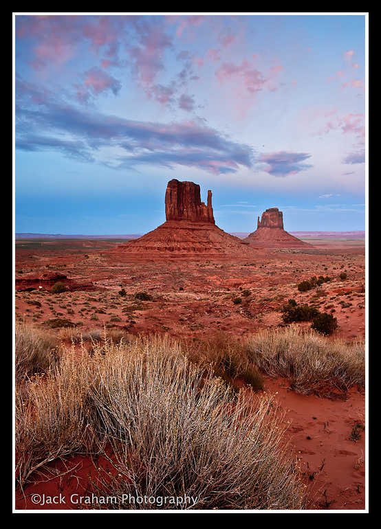
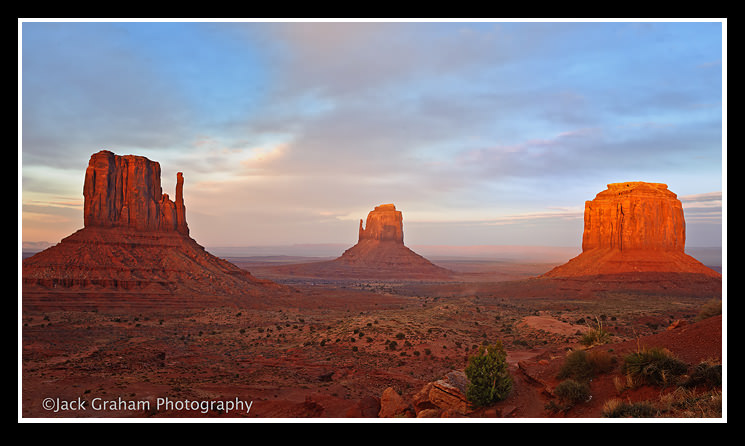
The image on Monument Valley was shot at the so called”Golden hour”, in very good light.
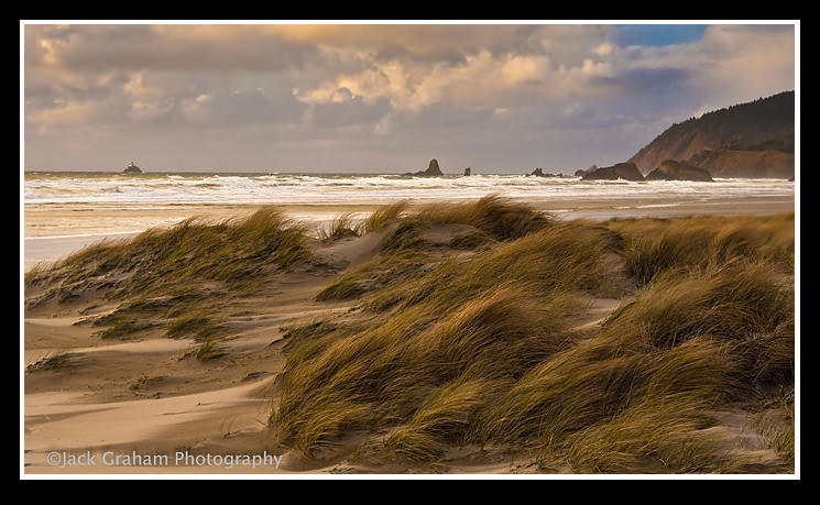
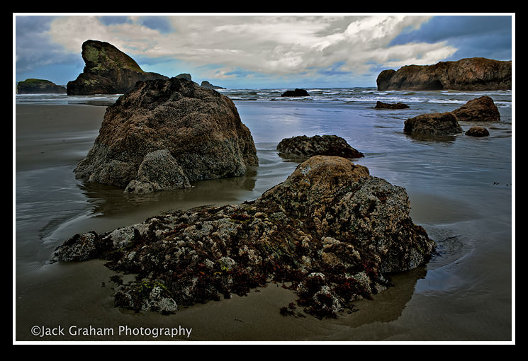
The second image was taken about 2PM on the Oregon Coast with a rather bright, but partly cloudy afternoon. First I limited all but a touch of sky and made the movement of the grasses the subject. I shot this 2/3rds under exposed to darken the image a bit. One might see this as being shot on an overcast day, but it was far from completely overcast.
COMPOSITION:
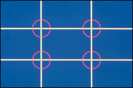 RULE: Always follow the rule of thirds…………………. Well, not always
The rule of thirds is the most important rule of composition. It is intended to place subjects in areas that are aesthetically pleasing. This rule was not invented yesterday. It’s stood the test of time
.
The “Rule of Thirds” divides each image into three areas both horizontally and vertically. In turn, a grid with nine squares, similar to a tick-tack–toe board is created. Each of the individual points of those squares is where your subject could be placed. The basic idea of this rule is to avoid centering an object.
Following the rule. The male cardinal is nowhere near the middle of the image. The rule of thirds is followed in this image.
In the two images below, it is easy to se why moving the center of the image just a bit makes for a much more pleasing image
BREAK THE RULE
There are a few special times when centering an object or subject works. Most often is when the leading lines are all moving in concert to the center of the image.
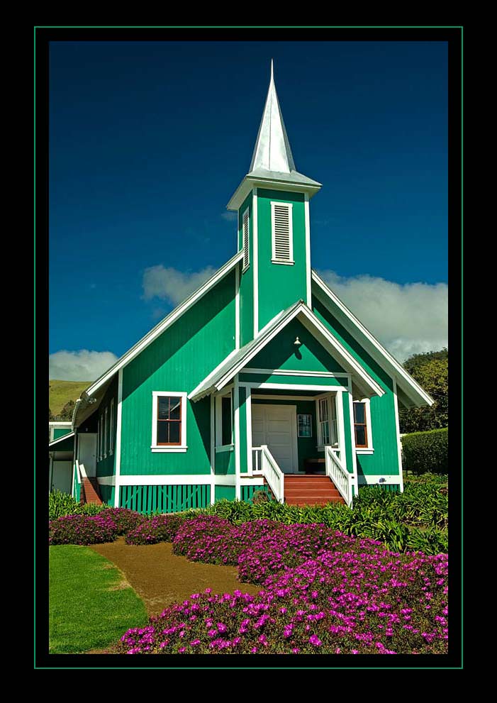
The image of the church on the left is a good example of a centered subject. In this case the subject takes up most of the frame. The flowers act as a leading line , bring you right up to the stairs and the front door of the church. Though the subject is in the middle, the image looks just fine.
It is important to determine how much negative space you want to have in your image. Negative space is the area around the subject. For example, if a subject happens to be is long and thin or on the smallish side, having more negative space will make the subject look lost within the image. Conversely, too little negative space might cut off the subject. …. And you may want that! Remember, if it works, break the rule.
Have I ever broken the centering rule, yes, when it works. If I choose to center an object because its shape allows the image to be more pleasing. Circular objects are a good example. A photo looking up into a domed ceiling usually works better with some centering
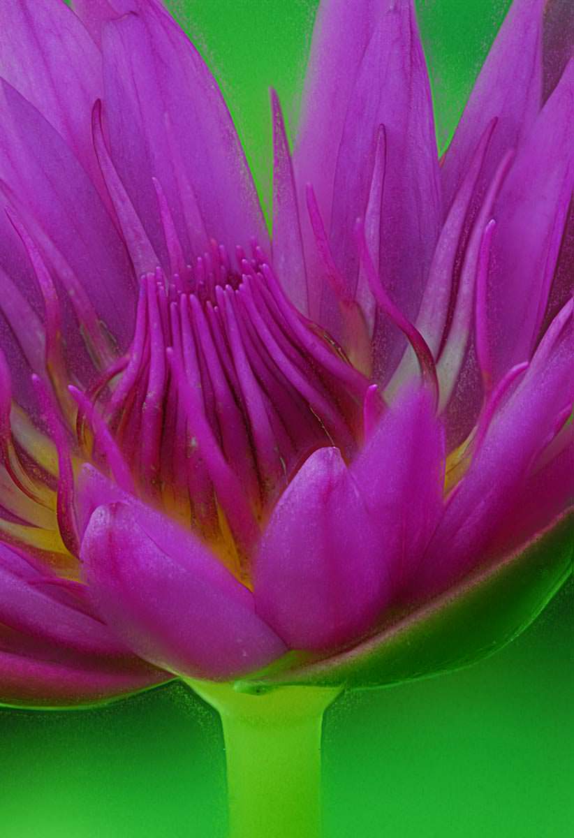
A round flower often needs centering to avoid cutting off portions of the petals. Buy why not cut off the petals, break the rule and get creative.
I never make breaking rules a habit, but sometimes it works. In the end I usually use the “Rule of Thirds” as my guideline.
VERTICAL or HORIZONTAL
The other main decision with composition has to do the deciding if the subject lends itself to a horizontal or vertical image.
RULE: The amount of negative space required to make a pleasing images is a major factor in determining which format is the best….) and then as always, consider the rule of thirds in both formats when making the image)….. And think creativity. If I break the rule, would it improve my image?”
As a photographer when in the field I will typically shoot both formats of a subject if there is any question as to the best format. I then make the decision at a later date which format works for me. Usually, each format conveys a very different feeling.
When I photograph waterfalls, trees or flowers with long stems, I tend use the vertical format. However if the same waterfall, flower or tree is photographed without the long stem or falling water, then the horizontal format might be considered over the vertical so there is more space surrounding the subject.
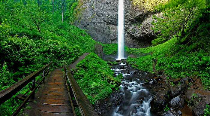
Both images are of the identical waterfall.
Again, if breaking the rule makes for more pleasing images, then by all means do it.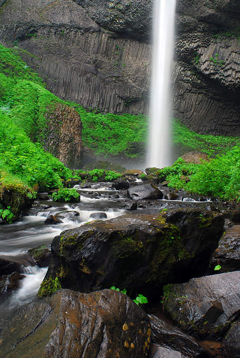
HORIZON LINES in composition are critical.
RULE: Horizons should generally be low to feature the sky, or high to the foreground. They should always be level straight and level.
Again, thinking creatively, you may want break this rule. Most often if I do, I exaggerate the horizons, making somewhat of an abstract image. You either want to follow this rule to the tea, or really break it and use your imagination.
The horizon line in the image of Monument Valley is almost right down the center of the image, however in this image I think it works quite well.
One area I almost never break the rules is when photographing subjects that are not stationery. Birds in flight, moving objects like boats, planes or cars should point in a direction they are moving towards. Without this direction they look like they are running out of the frame and into an invisible dead-end on the end of the image.
But I sais almost. The ram below is almost dead center. I wanted to show the path from where he came from in the background. Did I break the rule, of course, but purposely to show the environment he lives in and appeared from.
Exposure
Exposure is basic. One must take Aperture, Shutter Speed and ISO into consideration. Each has an effect on the other, though by themselves are separate considerations.
Rule: Smaller apertures will always give more depth of field, and a larger less. and a slower shutter speed will always cause more blurring, and a faster less. A higher ISO ( though modern technology is changing this drastically) will always create more noise in an image Proper exposure comes from knowing how these three affect each other and thus making the right choice for each scene.
Rule: Exposure itself should match whatever the lighting is in that situation.
For example, a moonlit landscape should look moonlit and not like mid afternoon. The rules for ISO, aperture, and shutter speed, are not debatable. However, a we can use these rules them to convey a feeling using light. I often try to replicate the scene as I observed it when making the image. However, experiment, and perhaps underexpose your image (usually overexposure will be less advantageous). You may find a totally different feeling being felt. If it’s interesting and pleasing, by all means break the rule!
Even is you have an acceptable composition, a bad exposure will destroy the image. Break the rules of exposure only after you master them. By the end of a workshop, my attendees are usually sick of hearing me preach getting the exposure (and composition for that matter) right in the camera. Editing often can not fix everything.
Photographers use rules, or lack of, and creativity to make pleasing images. We all are different and see in different ways. This is what makes each image and each photographer unique. Remember; break the rules only when you have mastered them. Be creative
We are all using creativity when we photograph a subject. Just breaking the rules doesn’t work by itself. One should spend time experimenting with the composition and the light, Using your creativity is the way to make pleasing images while breaking the rules. If a certain rule of photography blocks out your creativity, then choose to use it or try something different. Creativity along with other parameters is what makes one photographer stand out from another
Our life is filled with rules. We stop at red lights; sports are based on rule books. There are rules that we are not permitted to break. However in the arts and science, though based on rules as well. Many great discoveries were made by someone breaking a rule………………In photography, some rules can be more definitive and some more vague.


