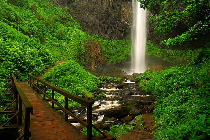
Jack Graham Photography www.jackgrahamphoto.com
Learn to See Learn to think Learn to create
VISIT MORE IMAGES on the 500PX Web site–CLICK HERE http://500px.com/JackGraham
This is a GREAT website for viewing some simply amazing images!
__________________________________________________________
2012 Workshop Schedule https://www.jackgrahamphoto.com/2012-workshop-schedule
2012 Registration Form REGISTRATION FORM 2012v9
Workshop Referrals: https://www.jackgrahamphoto.com/referrals
One on One, Individual Workshop information https://www.jackgrahamphoto.com/one-one-field-studio-photography-workshops
Workshop FAQ’s GENERAL WORKSHOP QUESTIONS_FAQ’S INFORMATION_v2012f
PODCAST: www.18percentgraymatter.com NEW PODCAST COMING LATER THIS WEEK!!!!
______________________________________________________________________________
 Jack Graham E-Book Series 1 & 2 now available for purchase and instant download:
https://www.jackgrahamphoto.com/shop/e-books
Noteworthy
WEBINAR———NIK SOFTWARE: I would like to thank the folks at NIK SOFTWARE for inviting me to host a webinar at their studio in San Diego from 2-3PM on Feb 28th. You have to register to attend. You need to register for this, and I know there are only a few spots left! ( they can register up to 1000 people). Click here to register: http://www.niksoftware.com/learnmore/usa/index.php/webinars/signup/12851?j=16013119&e=jack@jackgrahamphoto.com&l=175395_HTML&u=205139063&mid=115479&jb=0
I have a featured article in Landscape Photography Magazine this month. You can read it here:
http://landscapephotographymagazine.com/
_____________________________________________________________________
Workshop news and information:
WHIDBEY ISLAND & NORTHERN CALIFORNIA—Pacific Northwest Art School Workshops am conducting 2 workshops this year for the Pacific NW Art School. One is on Whidbey Island, Washington in May and the other is in Northern California in September. These are at a very special price and a tremendous value. Please contact them by clicking here, http://www.pacificnorthwestartschool.org/all/photography-workshops/graham-jack-photography-on-whidbey-may-9-12-2012
or call (360) 678-3396 for information Pacific Northwest Art School Flier
ULTIMATE ICELAND in July 2012—–ONLY ONE SPOT LEFT!… It’s going to a special trip! https://www.jackgrahamphoto.com/ultimate-iceland-july-2012
HIDDEN CHINA and optional TIBET:–Summer 2012 One of the 1st workshops ever to venture into Details here: http://www.phototc.com/tours/tour.php?tour=152
EASTERN SIERRA with GUY TAL — www.guytal.com OCTOBER 2012—There are only a few spots left for my Eastern Sierra workshop in October with me and my good friend Guy Tal. If you are thinking about joining us, please let me know ASAP. Rooms are also at a premium.
TETON NP / YELLOWSTONE NP WORKSHOP in September. Details are found here:
https://www.jackgrahamphoto.com/fall-grand-teton-and-yellowstone-np-photography-workshop
COLUMBIA RIVER GORGE in JUNE !! Wildflowers & Waterfalls!https://www.jackgrahamphoto.com/columbia-river-gorge-and-mt-hood-photography-workshop
FEATURED ARTICLE: WHICH ONE WORKS # 4
© Jack Graham
This is a new feature I am publishing here on my blog every week or two. I’ll discuss and compare images and talk about why I like one over the others.
This process is a common one that we all deal in our editing process. The editing process is as important as any stage in the making of a photograph. You should edit carefully, and be your toughest critic. In most cases the slightest difference in composition, light etc makes all the difference between a really good image and a great image.
Often we may take many frames of a subject in different light and different angles. Each frame can evoke a different feeling to the subject.
Always remember that you need a good subject and acceptable light, or your final image will probably be less than desirable.
Though art is subjective, certain aspects of correct composition are less. This writing is my feelings. You may disagree; if you do I’d love to know why. You comments, as always are more than welcome.
“The Palouse”
LOCATION. – The Palouse Region of Eastern Washington, USA. The Palouse is made up of rolling hills, old weathered barns and patterns in the wheat fields, accentuated by the light and clouds, which makes for some simply amazing photography. One must have their creative juices flowing to be successful photographing the Palouse. The Palouse is the richest wheat growing area in the United States due to the geographic location rainfall and rich soil.
These images were made in June, when the area is its greenest.
THE STORY: One of the most striking things I always look for are the barns, sitting on or within the green hillsides. As I am sure you know red and green, as opposite colors work well together. This time of year, the green is at its peak. When photographing here, it’s important to take the textures, patterns and color all into account in every landscape image. I did that in all 4 of these images. Keeping the image as simple as possible is also primary. These are working farms. There will be tractors, silos, and other added articles around the barns, property and on the roads and along the roads. Sometimes you wasn’t them there, sometimes you don’t. Can you clone them out, sometimes, but sometimes they may cause distractions and be unable to be removed successfully. Can they affect the feel of an image? You bet, as we will see here.
TECH DATA: These images were all shot back in 2006 on June 12th. Image and all were taken 8, minutes apart at ISO 200, using A Nikon D200 and a Nikon 300mm F4 lens (which equaled 450mm taking the crop factor into consideration). Apertures were all F16, and shutter speeds were either 1 /40th or 1/30 second.
I did minimal processing on these 4 images. The one which I select will be refined and look better than these, but for this exercise, we’re talking about compositional elements, not processing.
The finial-processed image will be included at the bottom of this writing.
Images were processed using Adobe Lightroom, Adobe Photoshop CS4 and as always Nik Software. Define was used first to remove any noise. I did not use Viveza 2 on these images at all, but did add Detail Extractor, Brilliance & Warmth, a slight amount of foliage enhancement and bit of vignette to each image, using the Nik Software’s Color Efex4 Pro.. Sharpening was done in Nik Sharpener Pro. There was minimal cropping done to these images.
The same amount of each filter/ sharpening etc was applied to each image. There are no variations in processing here, just natural light
THE EDIT: Let’s talk about each image, the pros and cons.
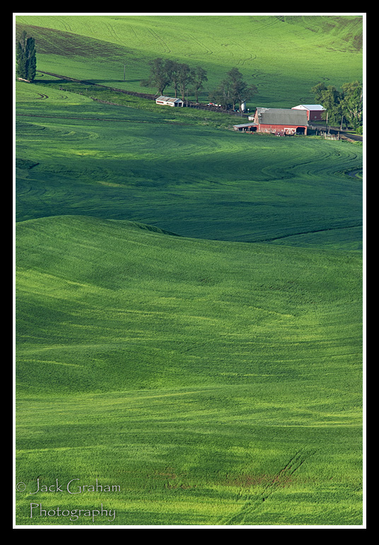
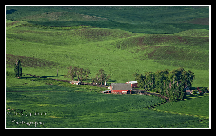
Image # 1
Pros: I don’t really see too many here at all.
Cons: Let’s start with a basic question you need to always ask yourself. What’s the subject? IS it the barn? Is it the green hillsides? If you cannot answer this, the image is a failure. I cannot answer that question looking at this image. Can you?
There are many compositional defects in this image. There is a huge excess of foreground that adds nothing to the image at all. Yes the rolling hills are nice, the shadows are to me just ok, but the only reason you know it’s a barn is because it’s red. Could I crop out or clone out that tree in the upper left corner. Why is even there? Perhaps because the D200 was a 95% view finder! Also, to me the barn is not 100% sharp.
TIP—Know what percent your viewfinder is and remember things may creep into your image. Live view will always show you a 100% view!
This image will be trashed and would never get to the processing area.
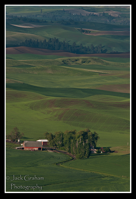
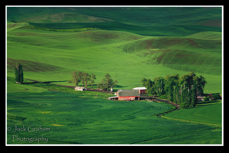
IMAGE # 2
Pros: To me this is an improvement that image #1, because of one factor. To me the barn is now the subject. At least we have one here. The simple placement of the barn in the foreground vs. at the top allows for a defined subject. This image was made 4 minutes after image #1. There is a nice leading line, the road coming from the lower right into the barn & house. The patterns are nice and the hillsides in the background are OK. Notice how the light changed in just 4 minutes.
Cons: The barn is not sharp enough, nor is the trees. This is still not anything to keep. Perhaps it might be a nice postcard, but nothing to hold my interest for more than about 10 seconds. It’s better than image #1, but to me, still a boring image.
I see many of these kinds of images, sometimes published—but this image will be trashed and would never get to the processing area either.
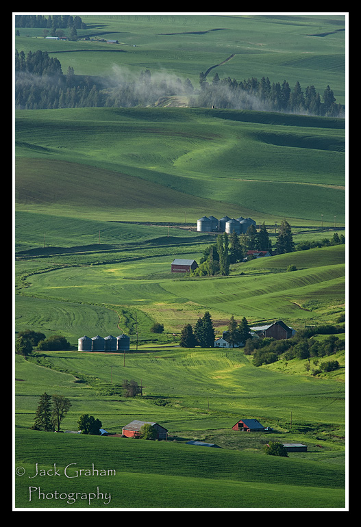
Image 3
No matter how I tried the images, even though there were some pros, was unusable for all the reason I stated. In the same general area, Image # 3 was taken 2 minutes later than image # 1&2. Here we have something to look at and to hold interest.
Pros: Just my looking in a slightly different direction allowed me to see something different. Because of the way it’s constructed, the content and layout is why this image is, so far, the superior. The red buildings and silos in the foreground make a pleasing anchor to the vertical view. This image says” Palouse”! The added suspense created by the dust blowing off the road at the top, as a vehicle, not seen, creates interest. The spacing on the barns etc is good. The light is quite nice as well. It’s a bit hard to tell in these compressed images but the barn and trees are much sharper.
Cons: Even though there is better subject matter here, there is also much more “going on” in this image than I really would like as a final shot. My eyes wander from the red barns up to the top and that dust, and then back down. Lets’ look for the subject again? What is it in your mind? I need the subject to be a bit more defined. The trees in the upper right corner also bother me a little but not terribly.
As a documentary image or a stock image this might be kept, but not certainly for a fine art print.
Image # 3, though a big improvement over 1 &2 is still a work in progress.
Image # 4
I remember when I made these sequences of images and remembered how I asked myself how I could define the subject better. Why not try a horizontal image?
Pros: The placement of the red barn is now in the right area. As a horizontal image, there is not extraneous apace on the top or bottom. To me it’s just right. I really like how the leading line (road) comes in from the lower left and through the image. The lone few trees on the left add interest. The amount of spaced used by the hillsides on the upper half of the image add interest as well. There is enough, but not too much.
Cons: I don’t have too many. As a nit pick, when I finish processing the image I’ll remove the shadow in the upper left corner. Did you notice this? I did. These kinds of things can distract from an image. In the final image I’ll add some structure to this image using Nik Software’s Viveza2.
In a span of 8 minutes these 4 images were made and the simple though to make a horizontal image saved the day. This scene just lends itself to a horizontal over a vertical image.
TIP: If in doubt, shoot both horizontal and vertical images. When you get in front of your monitor, and then make the decision. Both can work for different uses.
What do you think? … and if you would like to join us in the Palouse this June… click here for information:
https://www.jackgrahamphoto.com/spring-palouse-now-5-days
The right to download and store or output any content on this website www.jackgrahamphoto.com and www.jackgrahamsblog website is granted for preview purposes only and may not be reproduced in any form .All Photographs appearing on this site are the property of Jack Graham unless otherwise noted.
These photos are protected by U.S.Copyright laws and are not to be downloaded or reproduced in any way without the written permission of Jack Graham
By entering this site you accept these terms. If you need permission to use a photo on this site please call 503-625-21430 or email Jack @ Jack@jackgrahamphoto.com

