Learn to Think / Learn to See / Learn to Create
©Jack Graham
LOCATION
These images were made on Madeline Island, Wisconsin on the Western end of Lake Superior. It was early morning right before sunrise. It was quite a nice warm morning (for late September) but a bit breezy.
THE STORY
We were heading out to a sunrise destination on the Island that I had already scouted. As we drove quickly past this scene of the dock, chair, and the light, I looked to my right and immediately hit the brakes, turned around and instructed my workshop group to hurry to capture this beautiful peaceful scene. I know we had about 10 minutes until the light was peak, so I got everyone together recommended a lens and described what I was seeing. Many of my small group saw what I did. As happens, some of the group asked me “Why are we stopping? What are you seeing” How many times do you (we) drive past beautiful scenes like these on the way to a certain destination and pass up opportunities? I am drawn to the simple but strong depictions especially when the light is working so well. This was one of those scenes.
TECHNICAL DATA
I shot only four frames with a few minutes as I was busy helping my attendees.
For this article, all four images are Jpegs right out of the camera, not processed. I also shoot a RAW file as well. I typically process the RAW file for the increase in data.
All images were made on Sept 30, 2021 (see time under each image)using a Fujiflm X-T4 and a Fujifilm 16-55 F2.8 R LM WR lens, Really right Stuff Tripod and BH 55 Ball Head, A Breakthrough Photography X-2 GND filter. The graduated ND made the light more equal in the water vs the sky. I used automatic metering on all images.
Other data is under each image
IMAGE #1
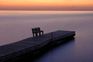
06:33:55
ISO 160 12 Sec and F22 -1/3
IMAGE #2
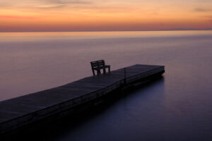
06:34:57
ISO 160 8.5 sec. at F22 -2/3

IMAGE # 3
06:36:32
ISO 160 7 sec. at F22 -2/3
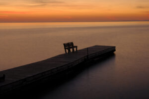
IMAGE # 4
06:37:16
ISO 160 4.5 sec. at F22 -1
THE EDIT
I love the simplicity of the scene. Graphically there is a lot of good things happening here. The lines are great, there are two distinct triangles in the upper left and lower right. Our brains like triangles!
The dock would have been great but having the bench at the end facing us was a gift. How do you pass this up! I framed this with the dock coming out of the corner, but slightly above the corner purposely. The difference in light from image one to image four is obvious. The saturation increased as the sun rose closer to the horizon. Also, the doc became more silhouetted as the sky became brighter. I liked that. I added just a bit more sky into each image. I like the amount of sky in image # 3 & four.
Obviously, the long exposures made the water nice and silky as I wanted to to be. I also increased the compensation by two-thirds of a stop from image 1-4. This gave me more saturation in the sky and increased the orange in the water. The shutter speed decreased as the sun rose and increased the light within the scene.
SO WHICH ONE DID I PICK TO PUT IN MY MASTER FILES?
I initially picked number 3. It was a bit brighter than #4. I used -2/3rds comp in number 3 and -1 stop comp in #4. It is effective. The doc had a bit of information in it as it was less silhouetted in image #3, I also like the slightly brighter sky. Image #3 is below, but read on!

But as is ever increasingly the case I took image #3 and processed it in NIK Silver Efex Pro. Though the image is perfectly satisfying in color the story of this scene is much clearer in monochrome. The beautiful light, to me takes away from the story. This solitary pier here in vast Lake Superior is so peaceful. I want it to depict it that way. Monochrome works better as far as I am concerned.
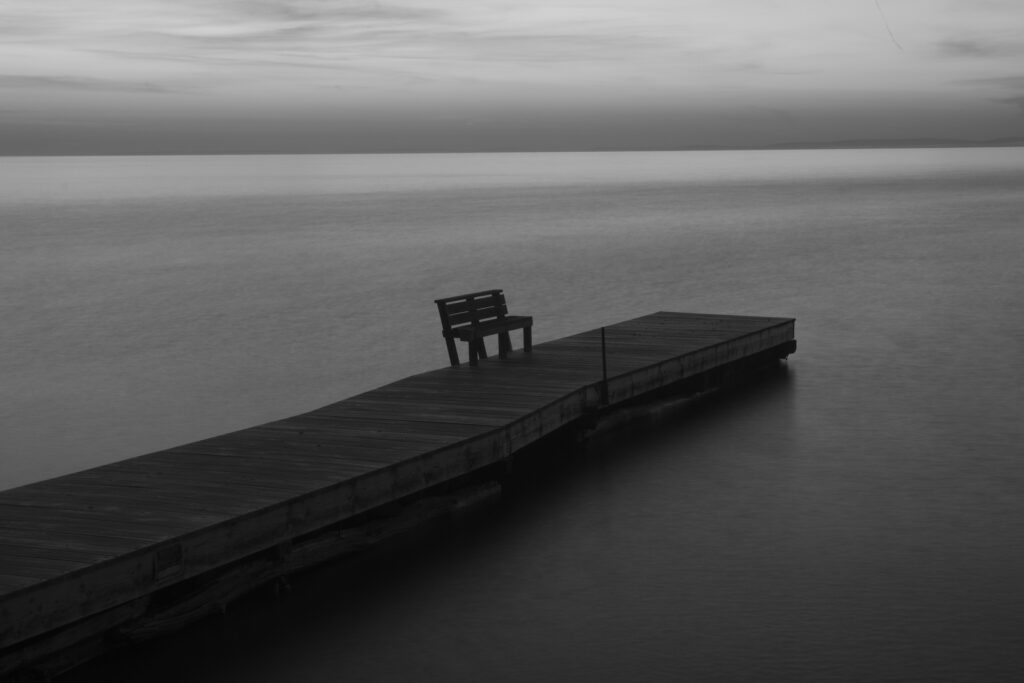
Now if I wanted to tell the story of a beautiful sunrise on the lake the color image would be better, but for me, it is the solitary dock, and the vastness of the water that works for me. Color can sometimes take away from the story. We are used so seeing color and so many sunrise images. I decided on something different. What about you?
As always, your comments are always welcome and appreciated.
Jack Graham


