I want to talk a little bit about monochrome considerations in photography. Often I am asked “why do I refer to black and white photography as monochrome? To me, there is a distinct difference between the two. Monochrome photography can be just that, a depiction of shades of any color. It literally means “one color”. It could be blue, green, red etc. Monochrome does not mean black and white, yet a black and white photograph is considered monochrome. Let us discuss the deviation.
Monochrome photography is photography that employs divergent amounts of light rather than colors to capture images. Color photography exhibits colors from across the color range, monochrome photography takes only one single color and renders a range of tones of that color. In black and white photography, varying shades of neutral gray are employed instead of the actual color of the scene. Monochrome is not exclusively black and white, Again, monochrome imagery uses varying shades of other colors. In black and white photography, varying shades of neutral gray are employed instead of the actual color of the scene. Monochrome is not exclusively black and white, Again, to explain the differences, monochrome can be different shades of a certain color, black and white used shades of gray as well as bright white and the blackest black.
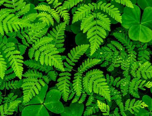
Monochrome Image, Green

Monochrome Image, Blue
However, for this writing, monochrome will mean shades of gray, ranging from black to bright white.
Monochrome photography is founded in the early development of photography in the early 1800’s. Color didn’t come along for about 100 years. Back then it was all “black and white”. Photographs, television, moving pictures were all in black and white. Many of use grew up in a monochrome world and those of us old enough to remember, black and white evokes memories of the past., sort of nostalgic memories.
Monochrome. images can be made “in-camera” or in post processing. Being a Fujifilm user and devotee, I love the monochrome film simulations available in their cameras. I have found that with other manufactures, it is better to convert to Monochrome in post processing.
… so why Monochrome?
I have found the most photographers I know either like color or black and white. Not many enjoy both. Most of these photographers are usually better with one than the other. For me I am one of those in the middle, I enjoy both and continue to try and improve in each venue every time out. Color or monochrome techniques can be used to capture the scene differently, to tell different stories. It is your choice as the artist to decide on which color palette you want to use for your photographs.
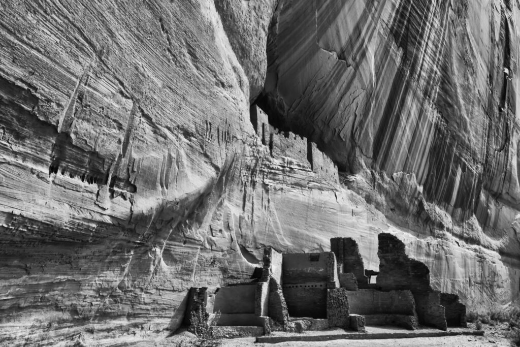
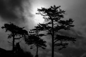
Canyon de Chelley, Arizona 1/40 f 22 IOS 200 -1/3
ABOVE: The lines on the red rock wall in the canyon lead you right to the ruin at the base. To me this is much stronger in monochrome and was made using the ACROS (with red filter) setting in my Fujifilm X-T2
One of my main reasons I really enjoy monochrome photography is that I do not really have to concern, myself with accurate color rendition. I do not have to visualize color changes or tonal management. Easy right? Well not that easy! When I make an image in monochrome, most times the shades of gray are 100% what I want. The compensation dial on my camera allows me to adjust the “tonality” of the shades of gray the way I want. As I mentioned, the monochrome film settings built into my Fuji camera make this even easier. I can spend more time on the composition, what I am seeing and what I am trying to say with the image rather than spending time dealing with color aspects.
Why is this important? First, color evokes certain responses to the viewer that are not as apparent in monochrome photography. For example, red is an extraordinarily strong color, and our brains react to red strongly. This is not the case in monochrome photography. Warm colors like orange, yellow motivate us in different way than the cool colors of blue and green. Again, this is somewhat of a non-factor in monochrome imagery. I do not have to worry about how the viewer will be influenced by these colors and hope they work well together.
The feeling I want to convey in the image is much easier for me in monochrome. I can work with the textures and patterns easier and thus concern myself with the emotion and feelings I wish to convey.
I do not want to make it seem that monochrome photography is easier than that of color. In fact, at times monochrome images can be more difficult as you have to perhaps work harder to create a compelling composition without relying on color to “carry” an image. Composition and telling the story is still something we all need to pay attention. Often these are the main challenges one finds when making interesting images. Simplicity for me still rules the day. Keeping this simple and uncluttered is always primary.
1/3200 F8 ISO400 -1 1/3 FUJIFILM X-T3
S-T-T
My go to three letter phrases for successful monochrome photography is STT. These three letters stand for stands for Simplicity, Tonal Contrast and Texture. At times I enjoy bright objects set against dark backgrounds as well as highly textured objects. These often excel in monochrome photography. Controlling shadows and highlights is something that is perhaps even more important in Monochrome photography than color.
Often folks say, “If the lights bad shoot it in monochrome”. That really does not work for me. Good light is just that… good light. Even in bad light, you still must balance the light to the subject and just switching to monochrome won’t help bad lighting.
As well, remember a good image is a good image whether its color or black and white. I also sometimes hear folks say, “Well if it’s not working in color, convert it to black and white” If there is no mood, good composition or subject, the image won’t work, no matter what. Always think like an artist. Its better to make fewer images of quality then volumes of mediocre photographs. Learn how to use light and compose according to what you are trying to say with your image.
I continue to use both mediums, color, and monochrome. What works better in either is a subjective decision. Some of the thinking processes are different, but most are similar. Get out and free yourself up and try monochrome. You just might find it to be a different way to think.
WHY THESE WORK

55mm 1 /1.3 sec F 5.6 ISO 1600 Fujifilm X-H1 -1/3
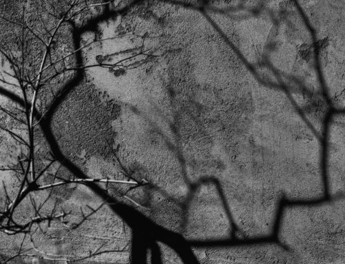
Old things have character. The subject here is the shape and patterns which asks you to investigate the detail of the scene. The absence of color lets you focus on the shapes, textures and patterns in the image and this is why monochrome works well for this type of shot.

77mm 1/400 sec F8 ISO 400 -1/3 Fujifilm X-H1 -1/3
This image is all about the light and graphic design. I used the Fujifilm 50-140 (handheld) to isolate the railing and contrast and underexposed to make the black contrast against the brighter background. Simple and symmetry were important to me when making this image.
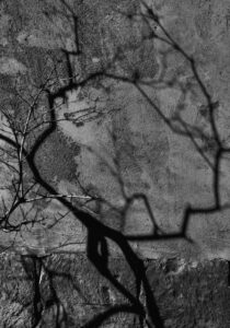
147mm 1/2400 F8 ISO 400 -2/3 Fujifilm X-H1
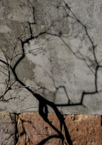
To me the stronger image is the monochrome image. The shadows and texture of the wall are more intriguing and telling the story I’m trying to convey more than the color version can produce. To me the color version is boring.

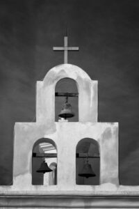
1/3000sec F8 ISO 400 -2/3 Fujifilm X-H1, handheld
One of the reasons the monochrome image works for me is the framing. I used more of the sky as well as contrast in post processing to bring out the subtle clouds. These images were made about 30 seconds apart. They both tell a story, but the monochrome image is far more dramatic. This building is the church at Mission St Xavier del Bac, built in 1797 about 10 miles south of Tucson, AZ.
200mm 1/7 sec F16 ISO 160 -1/3 Fujifilm X-T3
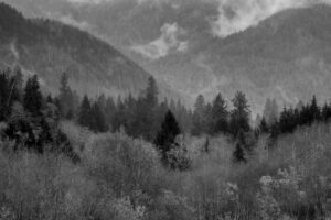
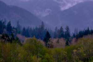 Again, to me, the color image is boring, and I tend to only look at the trees in the foreground. In monochrome, the drama of the weather and the location stands out. There is a story in the monochrome image, not so much in the color version These images were one minute apart. This location is Olympic National Park using a 100-400mm lens at 200mm.
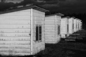
105mm 1/100 F22 ISO 1600 Fujifilm X-H1
These chicken houses on Whidbey Island made for an extraordinarily strong graphical image. Therefore, to me this photo works. They pull the viewer’s eye to the back of the image. The weather was such that the sky was very dark and stormy, but the sun was lighting up the white buildings. Bright against dark is a good combination when photographing in monochrome. Again, I used the Acros film simulation (red filter) to accentuate the dark sky and underexposed the image.

80mm 1/70 F 20 ISO12800 FujifilmX-H1 (Handheld) Fujifilm 80mm Macro Lens
These cacti were photographed at the Desert Botanical Garden in Phoenix, AZ. Because of the location I could not use a tripod, thus the high ISO (Thanks Fujifilm for low noise at these ISO’s !) The repetition of the shapes moving from upper right to lower left create drama in this photograph. Plus, just the patterns and textures alone make this a good candidate for monochrome considerations.
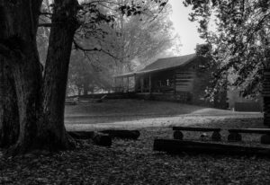
75mm 1/400 F8 ISO 1600 Fujifilm X-T3
This foggy morning in the Great Smoky Mountain National Park was ideal to tell the story of this photograph’s period house framed with the trees (something I usually do not do!) along with the atmosphere make this dramatic. The benches on the right and fence on the upper left are in this image on purpose to add balance. I did not even consider color for this photograph.
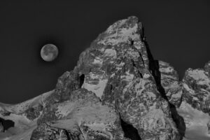
650mm 1/1500 F 14 Fujifilm X-T4 -1 1/3 Fujifilm 100-4000mm + XF-1.4 teleconverter
Right after sunrise in the Tetons in winter (December) the moonrise to left of the Grand Teton. Yes, the subject matter was amazing, but to me the juxtaposition of the round, smooth moon against the rugged textured mountain made more drama. Again, I underexposed a bit to darken the cloudless blue sky. (Acros, red filter simulation in camera)
76 seconds F18 ISO200 Fujifilm X-T2
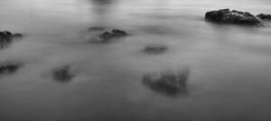
This image was made on Bandon Beach in Bandon, Oregon. I have photographed extensively there for many years and I honestly can say, unless there is a great sunset or something spectacular, I will never make another non-monochrome image there. I just see the world there in Monochrome, shades of gray at Bandon. Perhaps because it can be very foggy and ethereal, and I like to use the shapes of the rocks and sea stacks as subject matter. This is a long exposure in an abstract form. Without the rock in the upper right, you may not know that the other objects are rocks. This is one of those images that I hope the viewer will look at for a while and imaging what it is that he or she is seeing. Intrigue is always better in monochrome as far as I am concerned!

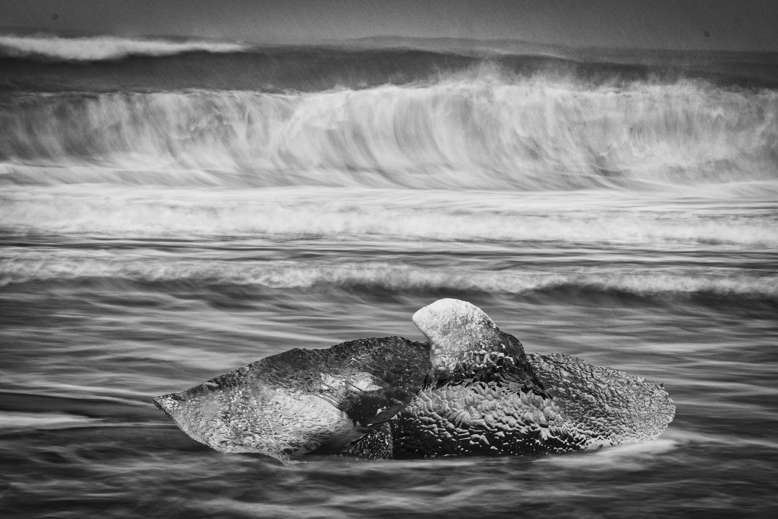
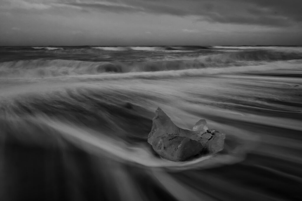
1.5 sec F20 ISO160 Fujifilm X-T3
This image was made in Iceland at Breidamekursandur. This is the famous Diamond Beach where the ice from Jokulsarlon washes back on the black sand after finding its way to the ocean a short distance away. The effect of motion is the subject here. The large crashing wave in the background in concert with the receding water in the foreground works in harmony here. Anchored by only one piece of ice, the image tells the story of the location with the dramatic effect I was looking for. TIP: next time you are photographing water on a beach at more than ½ second, photograph as the water recedes off the beach, not as its coming in. The effect is much more dramatic.
So there you have some of my monochrome considerations. Capturing drama, contrast, tonalities and shapes/textures are just a few of the reasons why you might consider shooting in a shade of monochrome.
Excellent in depth explanation of the subject matter and wonderful examples. Thank you!
Enjoyed the article. I too like shooting both color and black and white. I liked the examples and explanations. Hope to do a one-on-one with you sometime.